A car:
For a man this may be a fast sports car that he drives at super speed to show off power. The clothes they wear and the colour of the car would emphasize the masculinity. e.g. a smart suit for authority and power with shades for mystery and and edge. The car would be black/silver to show spohistication and seriousness.
For a woman it would be her getting into a car with all her best frineds having fun with plenty of shopping bags to show what they have been doing. Feminity would be shown through the outifts they wear and the colour of the car e.g. pink.
Bottled Beer:
For a man it would be him in casual clothing to show he is relaxing, in a bar surrounded by freinds having a good time drinking the beer. It would be shown masculine because the enviroment around him would be like an all boy's night out kind of theme; football on a t.v. his mates all around him, noisy and having fun.
For a woman it would be her sitting at home with a few of her friends getting ready to relax enjoying a cosy night in with the bottled beer, her friends, and the t.v. with a good movie on or what ever. It would seem feminine by the atmosphere created around the woman, whether it be outside or inside. feminity would be shown through the girly clothes that she wears, the people that are around her and her surroundings, a clean house a tidy kitchen.
Trainers:
For a man would be advertised as masculine by haing a man running/exercising with a fit physique to show masculinity, corded arms, toned body, lean muscles the whole lot to emphasize he is a real man - in the superficial world. The trainers would be seen as masculine just by being on a man and by him being healthy.
The enviroment around him would be that of hard working, so in a city or a gym. the colour of the shoe would also affects is gendered outlook. Black, silver, white, blue, masculine seen colours wold indicate what gender it was for. You wouldnt see a man runnnig around in bright magenta trainers would you?
For a woman, feminity would be seen through the outfit she wears, so she would be dressed in feminine sports clothes. the trainers would be automatically feminine just by being on a woman but the enviroment around her can also emphasize the product as being feminine. The colours of the shoe would have an impact on this as well, along with whatever type of design that might be on it. She would be running through a calm tranquil forest training and of healthy physique.
An Ipod:
An Ipod for a man could be seen as masculine by having him in an all men's bar loaning out his IPod to use as the source of music for the bar. Also it could also be advertised as masculine through sexuality for instance women could be attracted to him because of the gadget itself.
For a woman maybe it could be advertised as feminine by the location she is in and what happens with the prodct. So maybe she could receive it as a present and emphasize the fact that this product is what every woman wants, what every woman should receive because it is meant for women.
Deodorant:
Such a product for a man is simple to advertise in the media industry. Sex is a big indicator for what gender a product is made for. Seductive adverts immediately direct you what gender a product is for so a deodorant for a man would be him spraying it on and women begin attracted to him by him smelling nice and not being smelly or unattractive. Simple really and effective, now you know its for a man and what it does.
One for a woman would use the idea that women hate showing white marks so feminity would be shown through the woman being obsessed by how she looks. So a deodorant for a woman could be advertised by her trying on the product and being pleased no white marks show on her outfit, then her strutting away happily in outside in public or at a party or whatever. This obviously shows it is feminine.
Cigarettes:
Masculinity could be advertised for a man by having him surrounded my his male freinds smoking and not a woman in sight. The way the product is presented would show what gender it was for. So for a cigarette for a man you could have it advertised with him in a relaxed and casual manner as if just hanging out with his male friends.
For a woman it would be her enojoying the company of her female freinds and asking them for a certain type of cigarette that cold be indicated something that only women use. this idea can be emphasized by her clothing, her enivroment in a feminine seen location, like a kitchen, shopping place and so on.
Sharmin's GCSE Media
Tuesday, 4 January 2011
Advertising - Introduction
1.) What is the purpose of advertising?
The prupose of advertising is to attract new buyers and try to expand media attention and attraction to the company/oraganisatin, it informs or persuads people to buy/donate toward the certain subject the advert is aimed at. Advertising is the use of media to prompt people into buying the product or service and is also to promote the idea of the product itself. It is a way of targetting the audience into demanding more of the goods. The main purpose of advertising nowdays is to sell, sell, sell. Advertising is an easy way to get attention of people and promote your product/service in a way that will stick in people's heads. e.g. slogans, quotes, use of humour or something unusual. Advertising has many purposes thouhg, like informing, persuading, or generally harrassing you to buy their products/services. Advertising is also to influence purchasing behaviour/thoughts of the audience and is a powerful tool.
2.) Three recent advertising campaigns that grabbed my attention and what in particular interested me?
Third Advert: Meet the Little Fockers - No image uploaded due to technical diffuculties...
This advert always catches my attention because it is about a film that many people have watched and it has been recently released. Recent movie adverts always grab my attention like Narnia voyage of the dawn treader. This advert uses humour which really helps it stick in my mind. It uses the tense and funny relationship between the parent and the in-law father in the advert and unless you have watched the previous films will not fully be able to get the humour. Also, the concept of meet the parents Little Fockers attracts my attention for the previous films have been on the parents and their grown up children, so this film is about the newest generation of Fockers. This sparks interest in my mind and makes this advert memorable. The humour and aspect of another release of the Fockers interested me and the funny relationship between in-law and son grabbed my attention.
3.) Did I ever purchase a product because of the advert?
From my adverts no, I never bought the products however, yes I have bought products because of the adverts. Food is a big weakness for me. I have seen many delicious meals, foods and take-away adverts and they are the only things that actually persuade me to buy them. I love food anyway, but when I see a new type of burger or sauce or meal I just go for it. That is the only thing I ever buy because of the advert, especially pizza. Yummy.
The prupose of advertising is to attract new buyers and try to expand media attention and attraction to the company/oraganisatin, it informs or persuads people to buy/donate toward the certain subject the advert is aimed at. Advertising is the use of media to prompt people into buying the product or service and is also to promote the idea of the product itself. It is a way of targetting the audience into demanding more of the goods. The main purpose of advertising nowdays is to sell, sell, sell. Advertising is an easy way to get attention of people and promote your product/service in a way that will stick in people's heads. e.g. slogans, quotes, use of humour or something unusual. Advertising has many purposes thouhg, like informing, persuading, or generally harrassing you to buy their products/services. Advertising is also to influence purchasing behaviour/thoughts of the audience and is a powerful tool.
2.) Three recent advertising campaigns that grabbed my attention and what in particular interested me?
First advert:
This advert, the Go Compare Car Insurance advert grabs my attention with the use of its irritating slogan. The stupid use of the song is very manipulative as music very often gets stuck in people's minds, especially me, I find. The slogan is not very long and is very repetitive and thus very effective. the concept of the car insurance advert is not interesting or attention grabbing for me, it is the use of media and the way the company has chosen to portray their service that holds my attention. This is a very effective advert that always has me singing along to its stupidity of a slogan. Go compare, go compare ... ecetera.
Second Advert: Merlin bbc 1 image not availale could not upload
This advert captured my undivided attention. The main reasons because I love watching the series Merlin itself so of course I am interested in news about it. Secondly the advert is full of mystery and loud music and although it has noslogans no quotes it has adventure and action. The advert uses the curiosity and mystery to make you wonder what is going to happen next, it is like a short trailer in the form of an advert promoting the series to be watched and the teasers in the actual advert to be solved. It caught my attention because it used the theme music from Merlin the show and that triggered recognistion in my mind so immediately I wanted to know what the advert was going to say about the show. The concept of it simply being Merlin interested me and the actors grabbed my attention along with the teaser trailers of upcoming show. Also when they advertised the release of Merlin on DVD I was really interested since I already love watching the shows.
Third Advert: Meet the Little Fockers - No image uploaded due to technical diffuculties...
This advert always catches my attention because it is about a film that many people have watched and it has been recently released. Recent movie adverts always grab my attention like Narnia voyage of the dawn treader. This advert uses humour which really helps it stick in my mind. It uses the tense and funny relationship between the parent and the in-law father in the advert and unless you have watched the previous films will not fully be able to get the humour. Also, the concept of meet the parents Little Fockers attracts my attention for the previous films have been on the parents and their grown up children, so this film is about the newest generation of Fockers. This sparks interest in my mind and makes this advert memorable. The humour and aspect of another release of the Fockers interested me and the funny relationship between in-law and son grabbed my attention.
3.) Did I ever purchase a product because of the advert?
From my adverts no, I never bought the products however, yes I have bought products because of the adverts. Food is a big weakness for me. I have seen many delicious meals, foods and take-away adverts and they are the only things that actually persuade me to buy them. I love food anyway, but when I see a new type of burger or sauce or meal I just go for it. That is the only thing I ever buy because of the advert, especially pizza. Yummy.
Friday, 3 December 2010
Avril Lavigne: Be your own star
Avril Lavigne: Be your own star
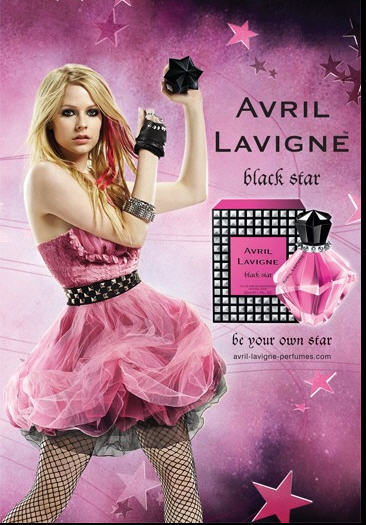
This is a distinct and well branded perfume that has been advertised and represented by a well known celebrity and idol. The target audience of this product is young to late teenagers, and actual fans of Avril Lavigne, she is promoting a punk-style of life. This can also include the trend of her style ranging to punk and rock teenagers. The Maslow theory includes the needs for prominence and to find the meaning in your own life as the slogan demonstrates ‘be your own star’
There is no particular setting to this certain advertisement; it has more of a show stopping lighted background with excellent use of full colours to relate back to the black and a mixture of rose and ultra pink perfume bottle and packaging; the lighting is definitely artificial and created by computer. There is a spectacular show of lightening that emanates and shines on Avril. It shines the spotlight on her as she is the main brand promoter; and makes her look like the centre of the advertisement and gives off a wow factor to the audience. The plush use of colour makes this advert look bright and appealing to the targeted audience; it uses stars in the background to relate back to the perfume name ‘black star’ and the slogan: ‘be your own star’. The stars are in with the whole pink theme and are floating around Avril and in the picture, some of them fading out to black to link with the overall black/pink themed colour. The background has been retouched and Avril has been air brushed.
Everything sticks to the theme of pink and black and Avril seems to look as if she is in power by her strong posture and the way she is looking directly through the advert seems to make it feel as if she is looking at you in particular. She is standing with legs wide apart and arms in the air doing some kind of pose that gives off the feeling of power and down-to-earth effect. This makes the product stand out more because she is linked to the pink and black theme and is holding a black star in her raised hand. She is wearing girly clothes that hint the targeted audience as young to late teens that are both punk and girly; opening the range of the audience to a variety of people.
Female Stereotypes in advertising
Female Stereotypes in advertising
Advert A:
I think Advert A is using ‘the alpha female’ stereotype for its advert. I think this is because they are using a woman who is focused in the actual picture and is definitely in control of her situation. She seems stern and powerful. Her facial expression is that of a serious tone and ‘hard working’ person that she is. She does seem rather scary, as is the portrayal of the actual stereotype. The fact that she is wearing glasses gives of the image that she is an intelligent and smart person, hard working and a business. She is wearing a maroon coloured formal shirt that shows she is in a working environment, you can also see books behind her in the background which further enhances and portrays the business woman image, the alpha female. Dominant and powerful, a career crazed person; someone who only has eyes for their career and that her life is work.
Advert B:
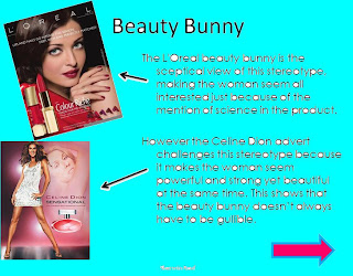
I definitely think that advert B is there is the ‘beauty bunny’ stereotype. This is because the advert that she is in, and the way she has been positioned and propped shows that she thinks that just because there is science used to describe and promote the product, she thinks that it is guaranteed to work. The stereotype of this advert says that the female (beauty bunny) is into every new invention and thinks it will work; she reserves her greatest enthusiasm for the latest shampoo, or cream etc. This is portrayed because she is using the mascara in this advert and smiling out to the audience, she seems to be satisfied with the quality of the product and there is ‘scientifically’ sounding text of information sub-headlined onto the advert. It has details of the science behind the product and models it on the happy ‘beauty bunny’ that is acceptable to any ideas that will let them improve their looks and image.
Advert C:
Advert C uses ‘The Fashionista’ (Kate Moss is used in this advert a well known clothes model) stereotype. I know this because the fashionista is a female representation of a woman that appears glossy in every magazine, such as vogue, the upper class and more expensive and well known brands; We can see it in this advert because the woman in this Dior advert is well dressed in branded and exclusive clothes and posing in a sitting position. She is wearing a Mac jacket that is tailored for the need of the advert she is staring straight into the camera. She looks like someone who is only interested in how they look and always wants to know about the new clothes and make up etc. She is the woman who is not old enough to care about her skin unlike the beauty bunny. She has neither personality nor intelligence. The woman in this advert is expressionless looking rather blank and lifeless, fitting into the stereotype of no personality or intelligence, just a beauty object. She is promoting a certain type of lifestyle.
Advert D:
This advert uses the ‘perfect mum’ stereotype. You can see this because the mum is seated in a buggy being ‘pushed’ by her small toddler. She is laughing and the infant looks like he is enjoying himself. It demonstrates the perfect mum stereotype by making her caring and nurturing, raising her children well and thinking only of them. It shows her with her child sharing quality time using slight humour since it is she who is being pushed in the pram instead of her child.
Advert E:
The granny stereotype is used mostly in life insurance adverts. The granny is holding a life insurance certificate and smiling, looking happy that she is covered for her death. This is because as an elderly person she is nearing the end of her life and senior people are best used in adverts such as this to emphasize the ‘importance’ of covering yourself. The granny in this advert is smiling and pleased that she is covered and the granny stereotype fits this type of adverts because she has few interests outside her grandchildren since the money from her life insurance will go towards paying for her funeral or to help out with her grandchildren, her own children and family in general.
Representations and Stereotypes in Advertising
Representations and Stereotypes in Advertising
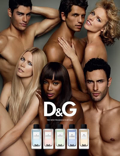
This is a positive representations in certain and limited ways. This advert shows and demonstrates the interconnected relationship of heterosexual links between the men and women. You can see a woman and man holding one another, a woman with her hand on another woman’s shoulder and has used an even number of men and woman, three each. Another way that they show the positive attitude is that they have used different races and skin tones; from white to black and Hispanic.
A negative factor to this advert is that there are some subtle stereotypes being reinforced; showing the audience that all women should be beautiful and fit, as in body and should be voluptuous and shapely ; because all the women in the advert are beautiful and have glossy, lovely bodies and seem to be attracted and enticing to men.
Also the woman in the top right corner appears to be sexually submissive to the man she is leaning against, another stereotype being displayed. There are no props used in adverts, just pictures of the actual product placed in front of the people by computer. The whole advert had an artificial light that shines onto the models. The background is simple and plain making the main focus of the eye on the people and the product that is in the immediate foreground.
The image has been retouched and airbrushed; the actual models’ skins have been made glossier and shiny, flawless. The target audience is people who are into this product and have a certain branded taste in perfumes.
Subscribe to:
Comments (Atom)


